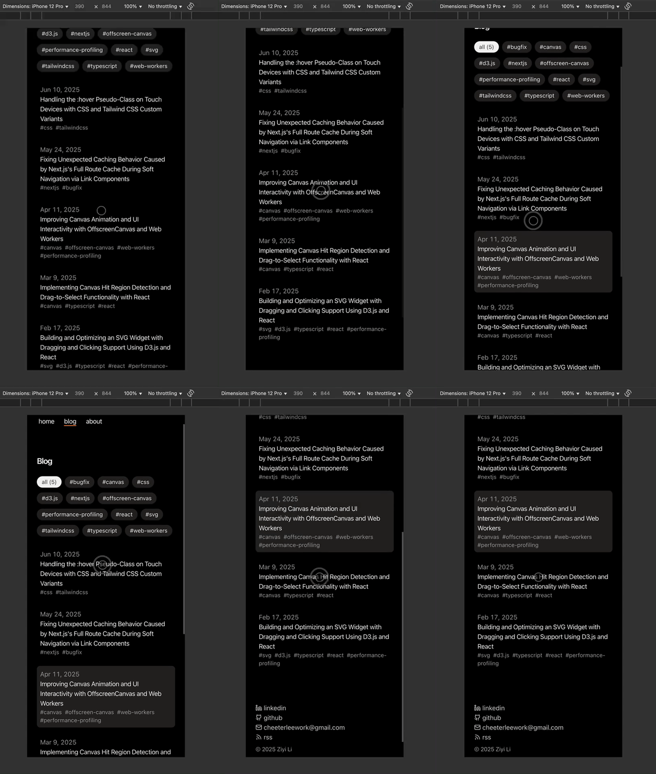
While working on my blog recently, I noticed that hover interactions don’t work the same on touch devices as they do on desktop browsers.
Since I haven’t had much experience developing for touch devices from scratch or seriously considering styling compatibility issues between browsers and touch devices before, I saw this as an opportunity to dig in and find a solution.
The Problem of Hover on Touch Devices
The current code is structured as shown in the snippet below, where we apply Tailwind's hover variant and utility classes directly to a React DOM element for styling.
// Component.tsx
function Component() {
    return (
        <div
            className='hover:bg-stone-200 dark:hover:bg-stone-800'
        >
            <PostContent />
        </div>
    )
}
As shown in the GIF below, the hover state doesn’t disappear when scrolling up or down the page, even though the cursor has already moved away from the element.

This behavior was captured using Chrome DevTools in mobile emulation mode, and it’s even more problematic on an actual mobile device, where the hover style tends to flicker unpredictably while scrolling.
Using CSS Media Queries
A simple approach to handling hover effects on touch devices is to use CSS media queries to detect whether the device supports hover interactions. This ensures that hover styles are only applied on devices where the :hover pseudo-class is supported.
We also use the prefers-color-scheme media feature to detect the user's system theme (light or dark mode) and apply corresponding hover styles accordingly.
// global.css
@media (hover: hover) {
  @media (prefers-color-scheme: light) {
    .post-link-hover:hover {
      background-color: oklch(92.3% 0.003 48.717);
    }
  }

  @media (prefers-color-scheme: dark) {
    .post-link-hover:hover {
      background-color: oklch(26.8% 0.007 34.298);
    }
  }
}
Additionally, the :active pseudo-class can be used to simulate hover-like effects on touch devices. This allows users to see similar visual feedback when they tap and hold on an element, helping create a more consistent and intuitive user experience across different device types.
// Component.tsx
function Component() {
    return (
        <div
            className='post-link-hover active:bg-stone-200 dark:active:bg-stone-800'
        >
            <PostContent />
        </div>
    )
}
As shown in the following GIF, the active style now applies correctly when the user scrolls or taps on a touch device.

Integrating Media Queries with Tailwind Custom Variants
CSS media queries are sufficient for most use cases. However, our current approach involves creating a separate CSS class for each hover effect, which can lead to quite a bit of code repetition, especially when many elements require hover styling.
Since we're using TailwindCSS, a more scalable solution is to define a custom variant that behaves like the standard hover pseudo-class. This allows us to write cleaner, more maintainable code.
Below is an example using TailwindCSS v4 syntax, which differs slightly from v3, though the core concept remains the same. After defining a custom-hover variant, we can apply hover styles conditionally using classes like custom-hover:text-red-600. This variant automatically checks if the user's device supports hover interactions, effectively replicating the behavior of hover:text-red-600 in a device-aware way.
// global.css
@import 'tailwindcss';

@custom-variant custom-hover {
  @media (hover: hover) {
    &:hover {
      @slot;
    }
  }
}
In our UI code, we can use it as follows:
// Component.tsx
function Component() {
    return (
        <div
            className='custom-hover:bg-stone-200 dark:custom-hover:bg-stone-800'
        >
            <PostContent />
        </div>
    )
}
Caveat: Tailwind CSS v4 still appears to be somewhat unstable, with minor bugs and compatibility issues occasionally arising in major frameworks like Next.js.